A Lesson in Color Theory: Part I
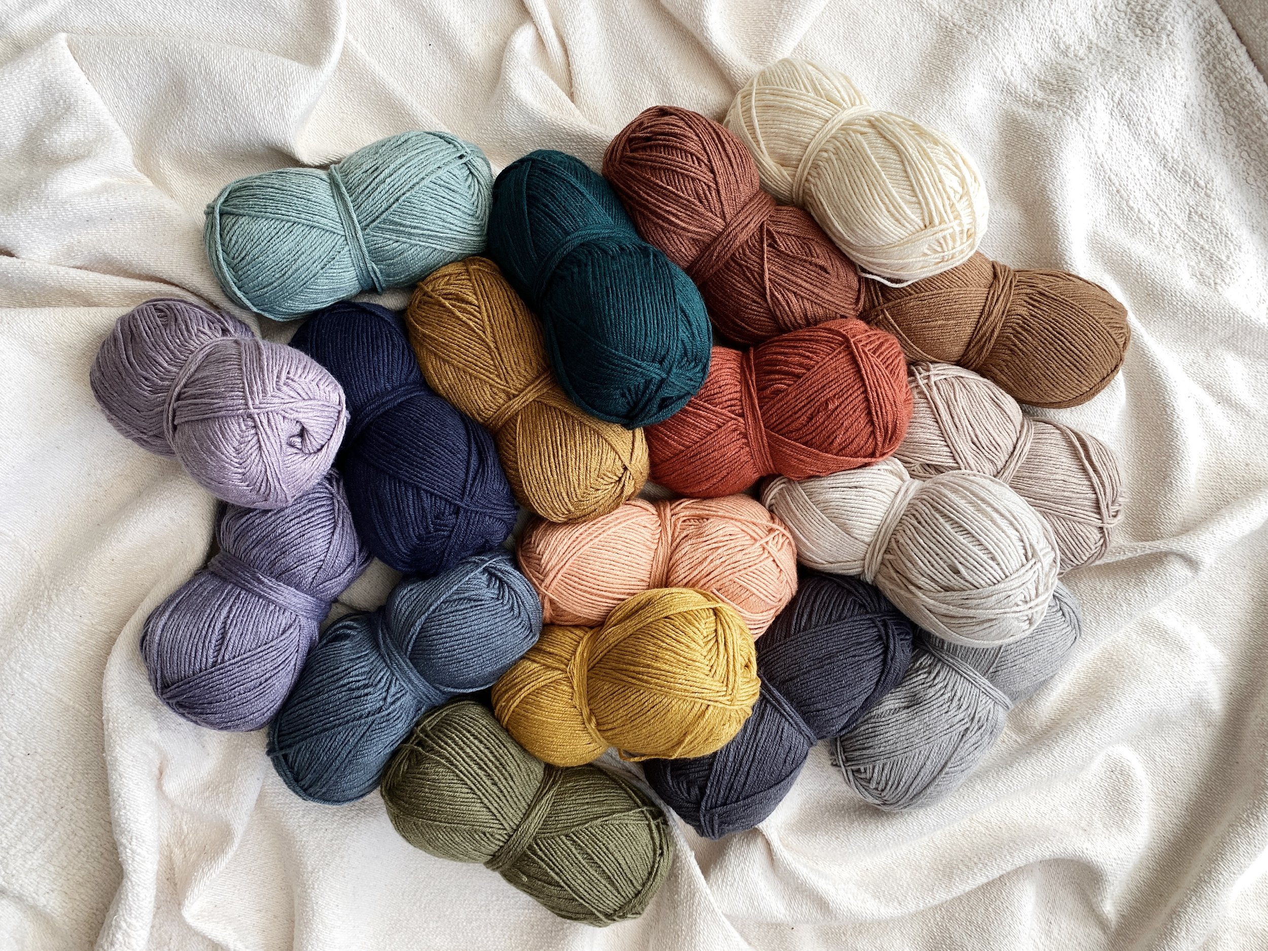
With the launch of my new Color Theory yarn in collaboration with Lion Brand rapidly approaching, I thought it would be fun to put together a series of lessons that help explain the meaning of color theory and how to apply it when selecting a combo for your next project. I'll also give some insight into the process I went through to create the 18 color palette for the yarn and some of my favorite pairings within it.
Let's start with the basics - what is color?
Color is the visual perception of the spectrum of light. To see color, you must have light. We see different colors because different objects absorb or reflect different wavelengths of light depending on their physicality. When the wavelengths reflected reach our eyes, light receptors transmit messages to our brain via the optic nerve, which then interprets these messages as colors.
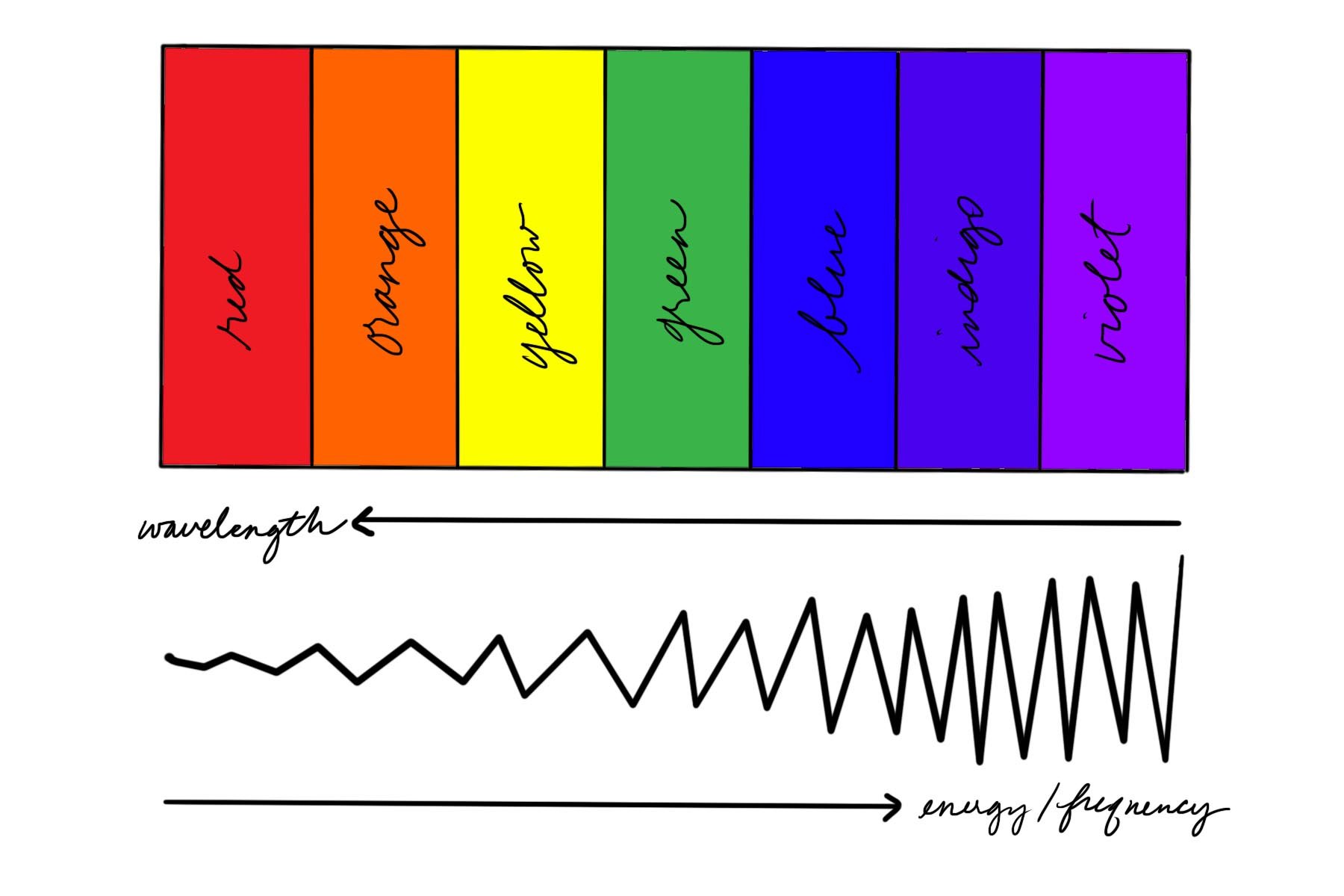
The color spectrum was first identified by Isaac Newton in 1666. He defined the spectrum of white light cast through a prism into 7 zones - red, orange, yellow, green, blue, indigo, and violet - with red having the longest wavelength, shortest frequency, and lowest energy and violet having the shortest wavelength, highest frequency, and highest energy.
The amount of light in a space and the influence of light reflecting off of colored walls or surfaces can change our perceptions of colors. Colors can also be affected by the colors around them. In isolation something may appear one color, but next to another color it can take on a different hue as our eyes try to balance the contrast.
Now, what is color theory?
Color theory is a set of principles and guidelines to arranging and combining colors in a visually appealing way. It is the study of how we perceive color and its influence on our emotions, mood, and behavior.
Color is one of the most powerful ways to communicate a feeling, and it has been used as a tool for everything from its healing properties as far back as 2000 BC to its ability to guide consumer choices in modern day advertising.
For our purposes, we will use the traditional 12 color wheel in our study of color theory as it is the most useful tool for understanding color relationships.
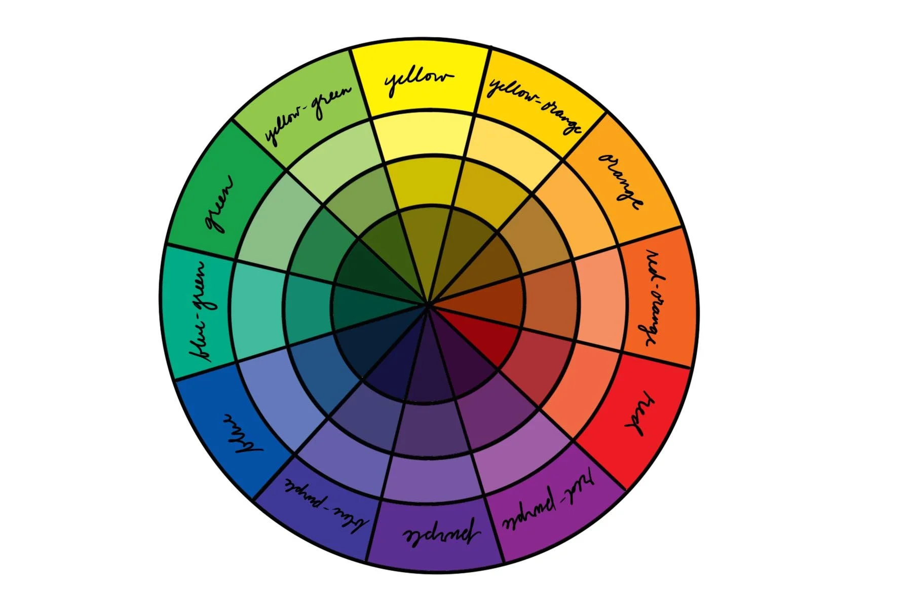
The color wheel is broken up into 3 types of colors - primary, secondary, and tertiary. The three primary colors are red, yellow, and blue. Secondary colors are those that are formed between these primary colors when they are mixed: green (a blend of yellow and blue), orange (a blend of red and yellow), and purple (a blend of blue and red). Finally, tertiary colors are those that are formed between a primary and secondary color when they are mixed: yellow-orange, red-orange, red-purple, blue-purple, blue-green, and yellow-green.

Then the colors get divided even further. You have likely heard the words hue, tint, tone, and shade before, and you may have even used them interchangeably with the word "color" (I know I still do!) but they are actually all different things. A hue is the pure pigment of a color, a tint is a hue mixed with white, a tone is a hue mixed with grey, and a shade is a hue mixed with black.

Color Theory yarn in Moonbeam, Satellite, and Thunder
Color Theory yarn tones, tints, and shades
I am personally a fan of tones, and you may have noticed that most of the colors in the Hue + Me palette are tones, while the others are shades and tints. This is partly what helps the now 30 colors in the Hue + Me palette mix and match so effortlessly as each hue within the palette is represented in a variety of tones, tints, and shades which offers really nice contrast while still having an overall muted feel.

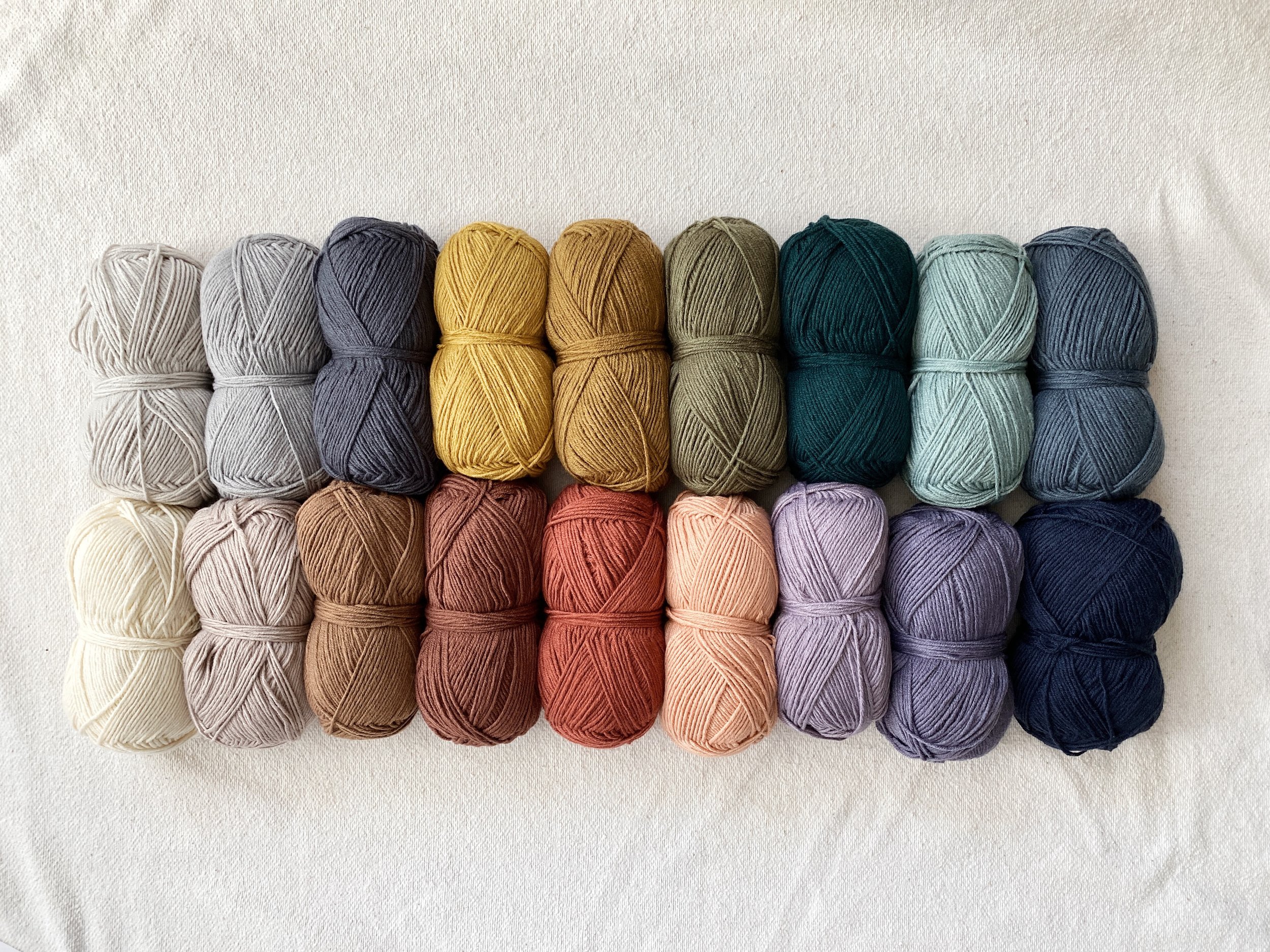
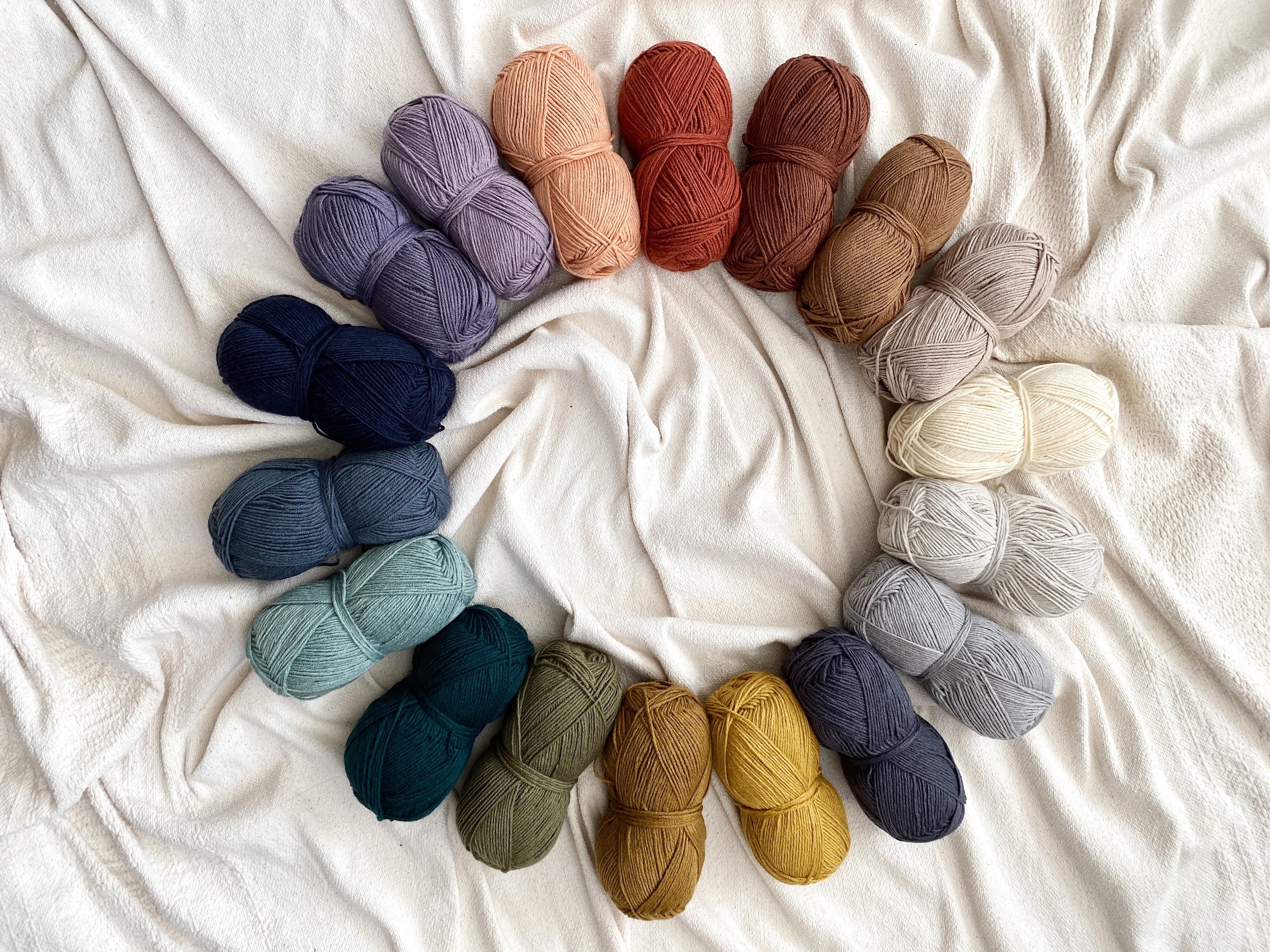
The full 30 color Hue + Me palette
Let’s check out some of the tones, tints, and shades in the new Color Theory palette!
Tint: Peacock + Ivory = Tourmaline
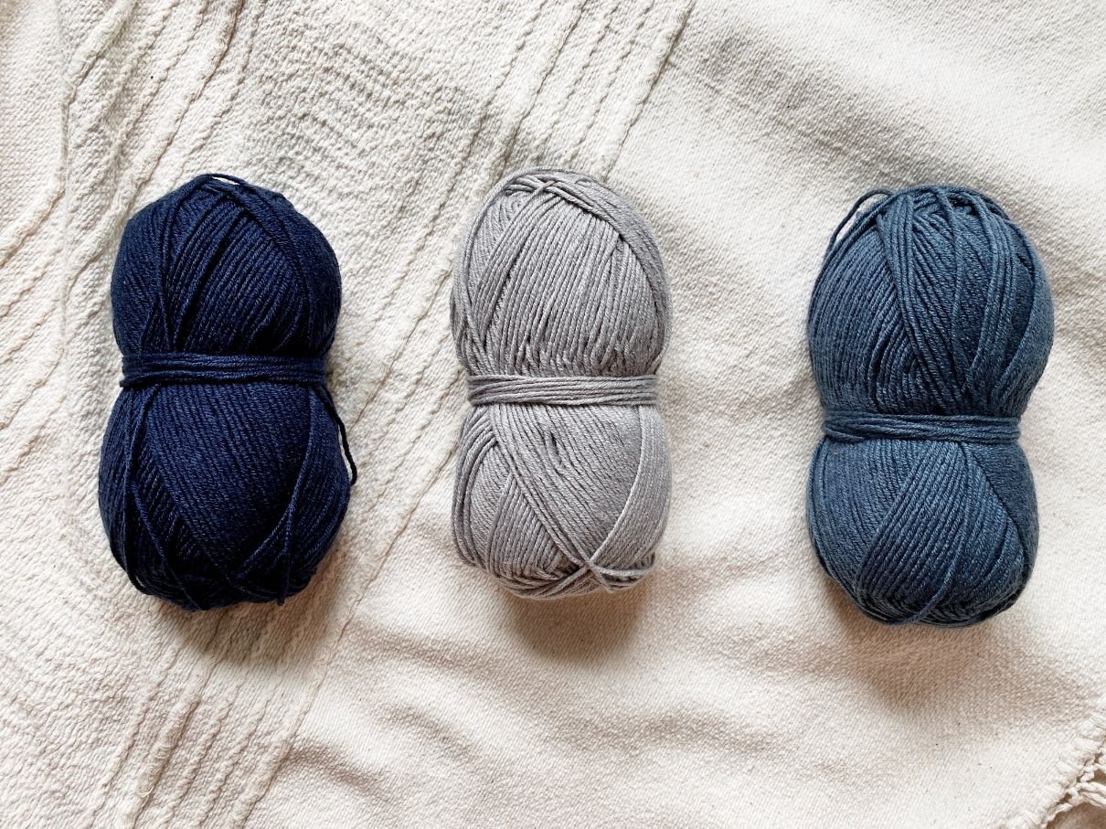
Tone: Admiral + Satellite = Stonewash
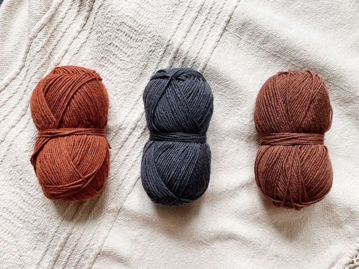
Shade: Canyon + Thunder = Raisin
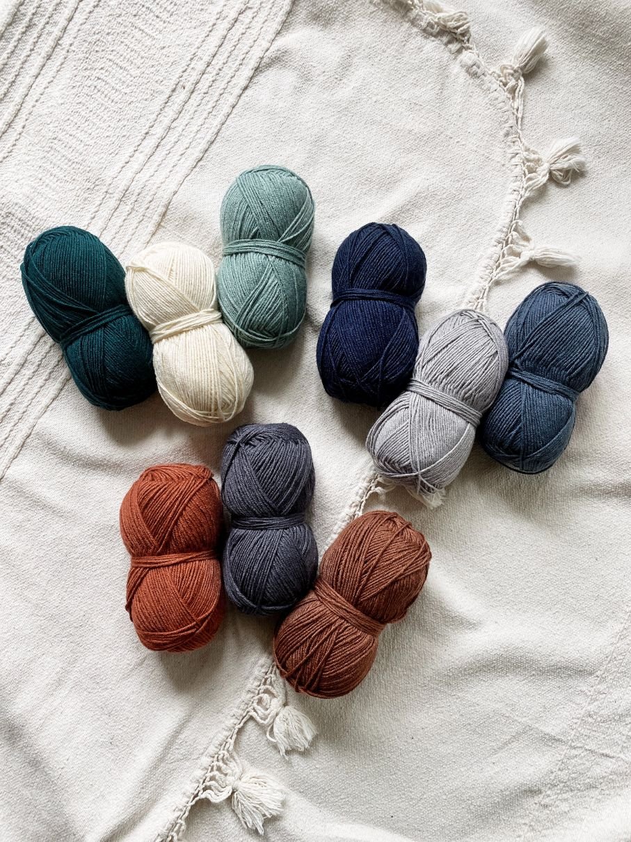
When I set out to design the new Color Theory palette, I used a lot of what I learned with Hue + Me and added just a touch more vibrancy to make it feel fresh and rich. Because Color Theory is a year-round, all season yarn, I was very intentional about choosing colors that would not only all mix and match with each other, but also suit a variety of seasons and applications. There are so many mini "families" of color combos within the palette, and in the following lessons we will be going over many of those.
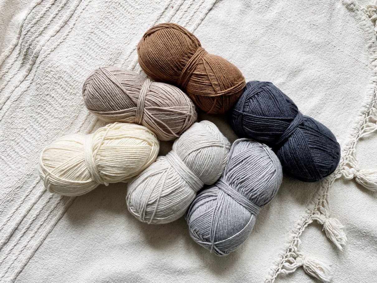
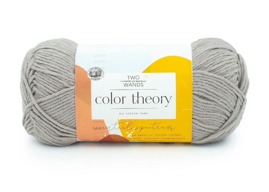
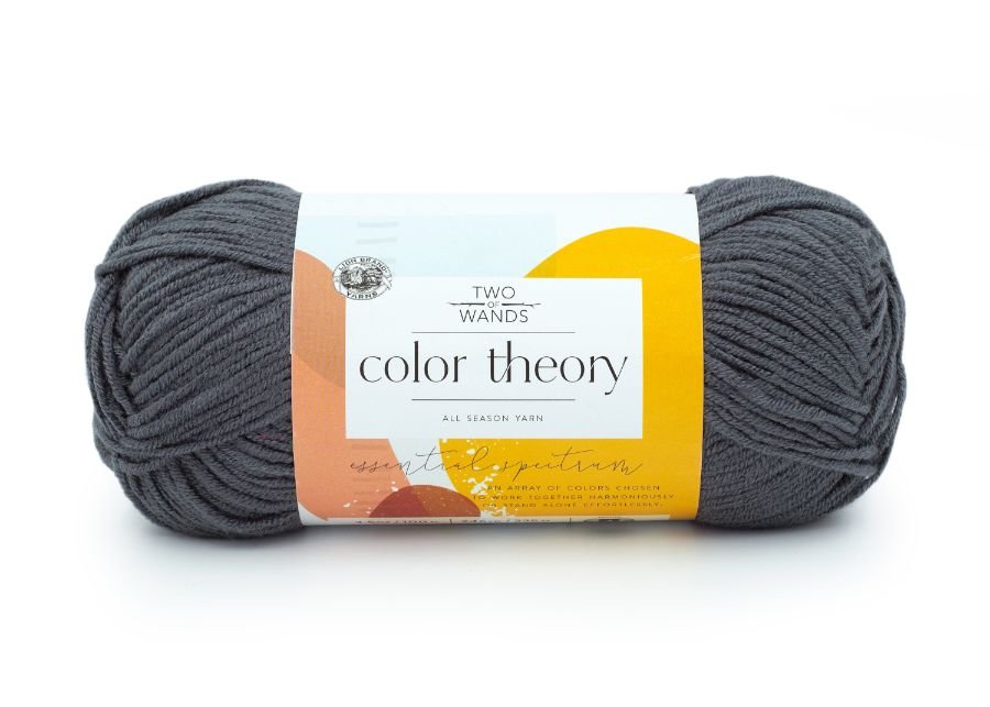
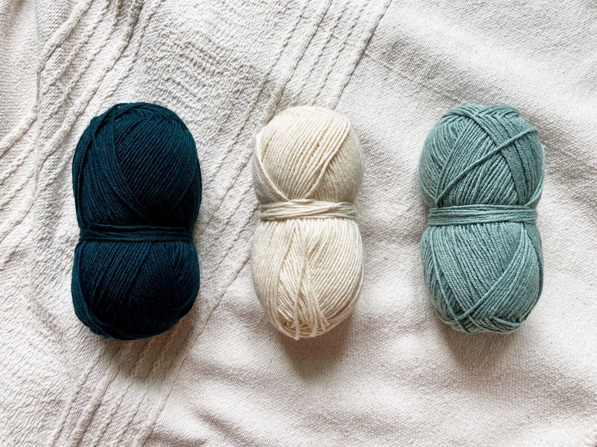
Color Theory yarn in Ivory, Bone, Nutmeg, Thunder, Satellite, and Moonbeam
I'm also a neutral lover at heart, so I made sure to include six beautiful neutrals in the Color Theory palette to balance out the vibrant colors. While neutrals may seem void of color, they actually contain quite a bit of it. The "temperature" of a neutral is determined by the color it contains. While blue is technically a cool color, and red is technically a warm color, temperature is relevant to both. For example, one red may be cooler or warmer than another red. Neutrals with more red, orange, and yellow tend to appear warm, while neutrals with more blue, purple, and green tend to appear more cool. This is similar to adjusting the white balance in a photo to make it warmer or cooler, which can completely transform the perception and mood of the image.
In the Color Theory palette you'll find three warm neutrals and three cool neutrals, giving you endless possibilities for combinations.
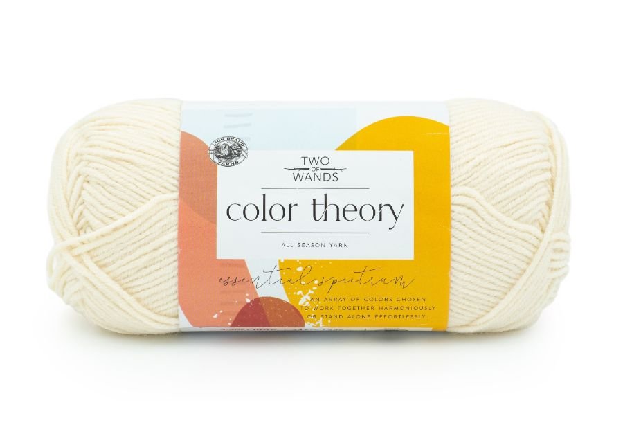
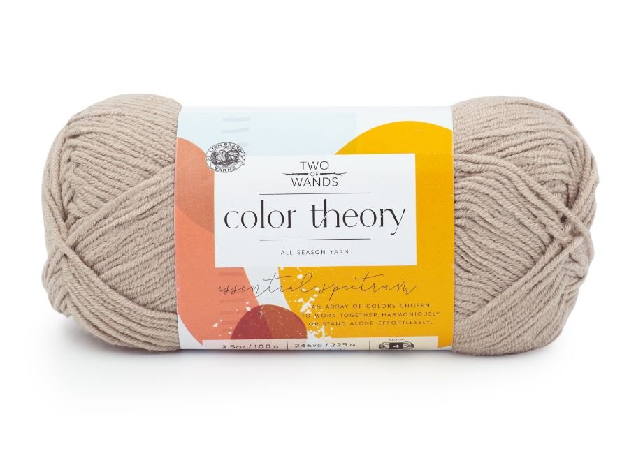
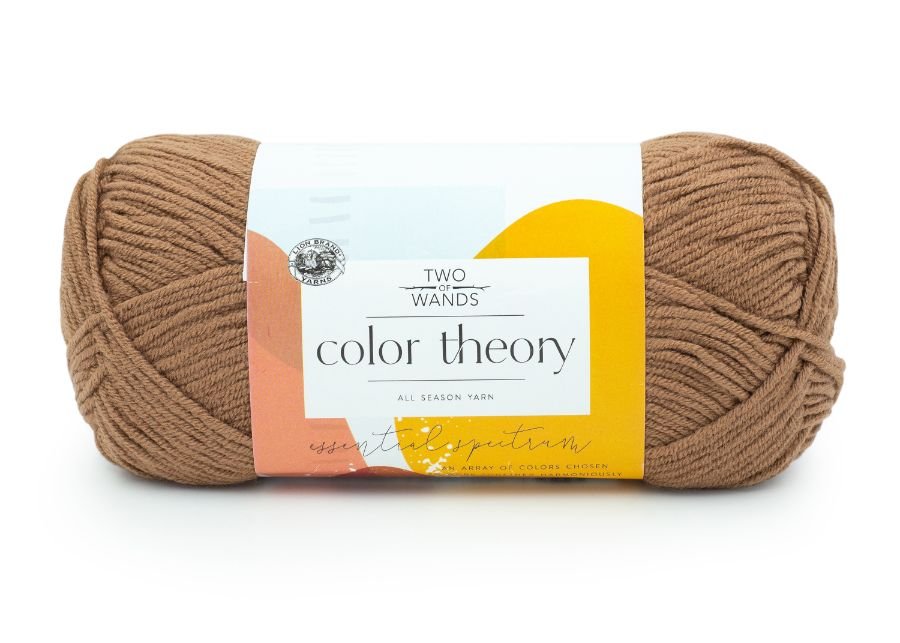
Warm neutrals: Ivory, Bone, and Nutmeg:
Cool neutrals: Moonbeam, Satellite, and Thunder: